What Is Opposite Red On The Color Wheel

The color wheel is a timeless tool that artists, designers, and everyday people use to understand how hues relate to one another. One of the most intriguing relationships is f...

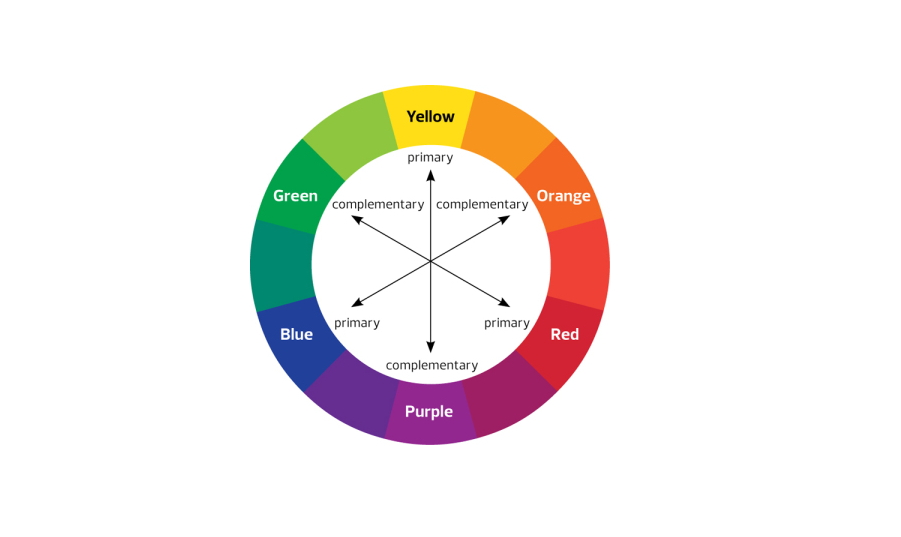
The color wheel is a timeless tool that artists, designers, and everyday people use to understand how hues relate to one another. One of the most intriguing relationships is finding the opposite of red, a question that sparks curiosity because red itself is such a powerful and attention‑grabbing color. When we ask what sits directly across from red on the wheel, we are really exploring color theory—the science that explains why certain combinations feel balanced while others clash. Understanding this relationship helps us create visual harmony and avoid disjointed compositions, making the inquiry both practical and enjoyable. Because red dominates attention, pairing it with its complement ensures the composition remains eye‑catching without becoming subtly overwhelming.
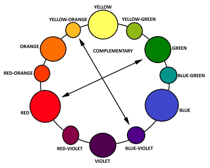
The primary purpose of identifying red’s counterpart is to unlock contrast that can be used deliberately in design. In the traditional RYB (red, yellow, blue) wheel, red’s opposite is green; in the modern RGB (red, green, blue) system, it is cyan. Knowing this lets you pair red with its complement to make each hue pop, creating focal points that guide the eye. Whether you are arranging a painting, setting a website’s color scheme, or choosing a shirt, the opposite hue provides a natural balance that feels visually comfortable and prevents visual fatigue.
These relationships shine in everyday situations where we want to convey a specific mood or message. Imagine a vibrant red wall in a café; placing a cushion or artwork in its complementary green creates a lively yet harmonious corner that encourages conversation. In fashion, a red blouse paired with a green skirt makes the outfit stand out without overwhelming the wearer, because the opposite hue provides a calming counterbalance. Even in digital interfaces, using red for alerts alongside cyan buttons ensures clarity and helps users differentiate actions quickly. For home décor, a red sofa beside a green rug instantly creates a focal point.
Must Read
Beyond aesthetics, the opposite red can influence psychological perception. Red often signals energy and urgency, while its complement tends to evoke calm and stability. Placing these side by side can balance emotional response, similar to how a bright sunrise (red) is followed by a cool, luminous sky (green). This principle is used in therapy rooms where soothing green walls are paired with red accents to keep clients alert yet relaxed, demonstrating how color relationships affect our feelings in real time. Marketers exploit this balance by using red call‑to‑action buttons against a cyan background for maximum clarity.
 How to Use the Color Wheel for Color Schemes and Mixing - HubPages
To explore red’s opposite on your own, start with a free color‑wheel app or a printed chart. Mark a dot on red, then draw a straight line through the center; the hue you land on is your complement. Experiment by mixing a small sample of red paint with a dab of its opposite to see how the two colors vibrate together. Try arranging three items—red, its complement, and a neutral—to notice how the composition flows. These quick exercises turn abstract theory into a hands‑on experience you can apply instantly.
Knowing the opposite of red isn’t just a party trick for designers—it’s a practical tool that brings balance, clarity, and emotion to countless visual tasks. Whether you’re refreshing a bedroom wall, designing a logo, or simply choosing a shirt for a meeting, the complement of red gives you a reliable partner that makes the primary hue shine while keeping the overall look harmonious. So next time you see a splash of red, remember that its counterpart is waiting nearby, ready to turn ordinary scenes into striking, well‑balanced works of art. Keep a swatch card of complementary pairs to quickly reference them whenever inspiration strikes subtly.